Foursquare and Twitter both released experiments that let you look at a visualization of your activity on that service over time. One is art that happens to convey information and tell a story of your travels thru time and space. The other is a functional dashboard that is designed to give you and idea of how effective you are in getting your message out to others.

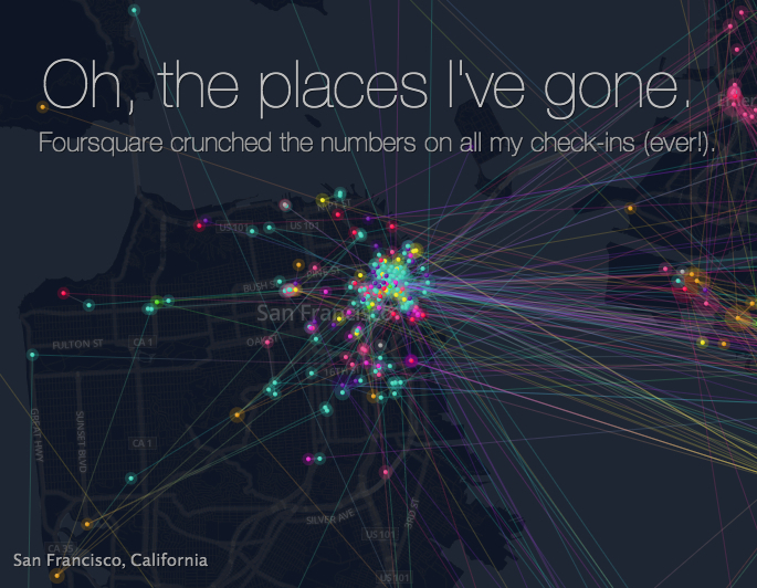
The Fourquare visualization is sponsored by Samsung and is clearly branded so. It’s a well done, if slightly solipsistic, eye-candy. Foursquare got their money up front on this one and used it so their users (including me) would have something beautiful that they wanted to share along with their sponsor.

The Twitter timeline (read The Next Web for details on how to get to yours) shows mentions and follow/unfollow activity along with details about specific tweets and how they performed. There’s also a screen that shows your follower growth over time along with some basic demographic information. It’s all business though, a reason for the normal folks to login and poke around their ad platform and think about spending money on some of twitter’s ad products. Tucked at the bottom of their graph is a sober message reminding us that we’re browsing through a business tool.
And there, my friend, is the difference between these two efforts:
Foursquare: Zoom through time and space as you visualize all your check-ins
Twitter: The data reported on this page is an estimate, and should not be considered official for billing purposes.
Leave a comment