Tag: maps
-
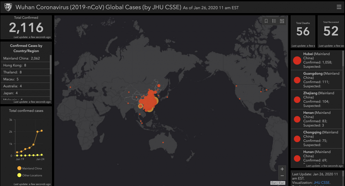
Coronavirus visualization
The Center for Systems Science and Engineering (CSSE) at Johns Hopkins is pulling together data from the WHO and CDC and two Chinese health site, the NHC and Dingxiangyuan into a Google Sheet the drives the visualization above. You can read more about the map and how they put it together on their blog.
-
Baseball Fandom, Visualized
From a New York Times deep dive into how people list their preferred baseball team on Facebook. “Like the Mets, the Athletics are the less popular team in a two-team region — less popular everywhere in that region, based on the data from Facebook. Again, winning the World Series matters. The Giants have won two…
-
Google Maps Gallery
10 years ago, when I was looking for a place to live, I had three maps to help me zero in on where to look. I was concerned with schools so I had a map from greatschools.org along with a school district map showing which houses served which schools. I then had a real estate…
-
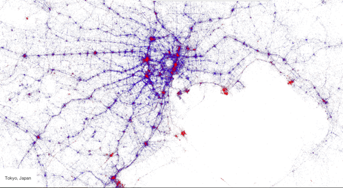
Digital Contrails
What do you do when you have access to the twitter firehose and a top notch geo-visualization artist? Make beautiful maps of course! Gnip and Eric Fischer got together with MapBox and plotted millions of tweets by location, language, and device to come up with some fantastic interactive maps. The map above is Tokyo…
-
Google Glass and Time Travel
A lot has been written about how Google Glass will be great for those that put on a pair. Immediate access to the world’s most powerful database, push alerts from your closest friends, a voice UI so you can look up directions without having to look down at your phone, a camera that lets you…
-

Japanese Maps a Unique Challenge
The New York Times has a piece pointing out that the new iOS 6 cartography woes that Apple is experiencing are amplified in Japan which presents it’s own unique mapping challenges. Mainly because they are trying to jam a global mapping paradigm into Japan which has its own challenges. … cities like Tokyo are changing…
-
Digital Cartography
Eric Fischer takes large datasets and turns them into art. His flickr stream is a collection of fascinating time-series maps plotting data over time to draw out shapes which take on a greater meaning. Weather it’s a map of taxis in San Francisco or an overlay of flickr metadata on top of NYC, Eric’s creations are at once…
-
iPhone Tracker Art
Dav Yaginuma, my brother-in-law, exported his iPhone’s location data and, using the open source iPhone Tracker modified the settings to create very fine grained view of his whereabouts. I would have thought an aggregated view such as the one above would give a strong signal to where he lives and works but I guess he…
-
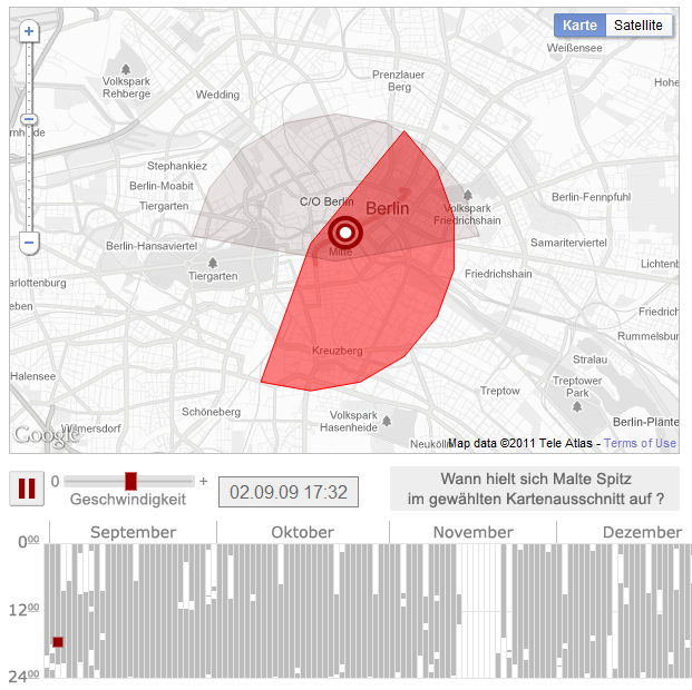
Location Traces as Art
Determined to teach others how much data telecom providers not only harness but retain, German Green Party politician, Malte Spitz, sued his cell phone service provider, Deutsche Telecom, for his location data. What he received was raw data of his location, signal strength, and when he was on the phone. Working with the German newspaper Zeit, he then…