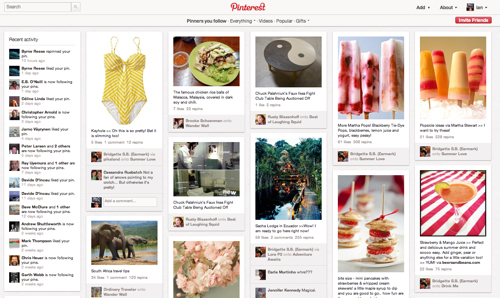
By now I would imagine you’ve all heard of Pinterest. The latest site to cater to our need to collect and curate the world around us has boiled down the act of clip-n-share to it’s most basic form, the image. If a picture is worth 1,000 words, then the endless scroll of the Pinterest front page is the modern web’s newspaper.

The site has been around since 2010 but only recently has it jumped into the forefront after a lengthy nurturing period with the Etsy-crafter-design set. Their strategy was smart. Close attention to detail allowed the small team to grow the service naturally and allow the community to gain a voice. Since late last year the site has been growing by leaps and bounds as the Silicon Valley set has taken to the site in droves and driven user growth through the roof (52% growth from January to February to 17.8M uniques according to comScore).
Along with growth comes a host of real world problems. Spam, copyright complaints, user backlash one (affiliate links), and user backlash two (design changes). Even the US Army is on Pinterest. But the Pinterest folk are smart people. They’ll survive and if they do right by their core users, they’ll make it through. The service reminds me of the early days of flickr and I wish them the best of luck.
As a product guy, what is interesting to me is how the Pinterest design motif has popped up overnight. It’s almost as if every site out there is re-thinking itself and the designers all have dynamic grid filters on that only allow them to re-arrange content on the page into floating block-sized chunks. I would argue that what we’re seeing today is as significant as the AJAX-ification of the web we saw in 2005.
Several design trends are converging that are helping along the pintrification (gosh, I hope that doesn’t become a word) of the web.
Tablets – the tap and swipe interaction of tablet devices lends itself to interaction via the visual box metaphor we see today. As a navigation device, it’s a lot easier to tap on an image than a headline so why not make the thumbnail image the thing to click to open up an article?
Metro UI – When Microsoft put on their thinking caps to reinvent the phone ui for their Windows Phone 7, the Metro UI was their primary breakthrough. Inspired by transit system signage, the UI emphasized grouping similar tasks into squares so you would drill into related sub-tasks instead of scrolling through a hierarchical list of folders and files. This same UI is now being adopted in the next version of Microsoft Windows, Windows 8.

jQuery plugin Masonry – comments on a recent CNET article give credit to Masonry as the catalyst of many WordPress themes that took on the grid look.
CSS3 and Responsive Web Design – Since Ethan Marcotte’s manifesto in 2010, and thanks to the evangelism from sites such as Media Queries, we’re seeing more and more sites embrace responsive web design including, most famously, The Boston Globe and Good Magazine.
The conversion of all these trends & technologies will cause an explosion of dynamic grid designs this Summer. Like swoosh logos, rounded corners, brushed aluminum, and all the glossy icons that came before, this new trend will take the web by storm. If you’re interested in turning your own blog into a tablet friendly grid, check out Pressly or Onswipe and join the party.
If the growth trajectory of Pinterest is any indication, the service is off to a great start. Because of it’s growth and because imitation is the most sincere form of flattery, the dynamic grid is here to stay.

Leave a comment