What do you do when you have access to the twitter firehose and a top notch geo-visualization artist? Make beautiful maps of course! Gnip and Eric Fischer got together with MapBox and plotted millions of tweets by location, language, and device to come up with some fantastic interactive maps.

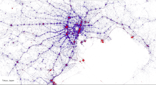
The map above is Tokyo and the blue dots represent the location of geo-stamped tweets by people identified by their tweet history as locals while those dots in red are “tourists” who normally tweet from somewhere outside the region. The map tells you a couple of things.
- Most tourists are tweeting (photo-sharing?) from the major city centers. I can recognize Shibuya, Shinjuku, Marunouchi, Yokohama, Ueno, Ikebukuro, maybe the Rainbow Bridge?
- If you’re familiar with Tokyo, you can see that people tend to tweet while on the train.
This second point reminds me of something I read in Wired a couple of years ago. In an experiment, researches placed oat flakes in a pattern that resembled the major city centers in Tokyo. Then they place a culture of slime mold in the middle and let the culture figure out how best to harvest or “move around” the oat flakes across the pattern. What they found was that the mold grew a series of tunnels that matched the patterns found on the metropolitan rail system.
What works on a large scale also fits a pattern at a much smaller scale.

I’ve written about Location Traces as Art before. Even before the crazy NSA/Snowden tracking scandal broke it was a well-known fact that the phone companies had a wealth of data about us. Aggregated en-mass in platforms such as twitter, this data can paint an pretty amazing picture of the world around us. A couple more maps from the Gnip/Fischer/MapBox collaboration.

It’s a little hard to see but this is a map of the world that shows which type of twitter client is used when a tweet is made. The Red is iPhone, Green is Android, and Purple is Blackberry. Looks like Spain is big on Android (for twitter anyway) while Saudi Arabia, Mexico, and Southeast Asia are Blackberry strongholds (where BBM is huge).

If we look at my neighborhood, you can see that I mostly live in an iPhone town except for a Oakland/San Leandro which is more into Android. I know what you’re thinking, The Atlantic already wrote about it. When you see lots of green, it usually signifies a less affluent area.
Fascinating stuff.
Leave a comment