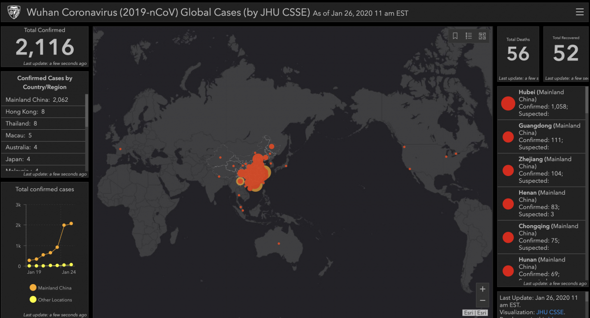
The Center for Systems Science and Engineering (CSSE) at Johns Hopkins is pulling together data from the WHO and CDC and two Chinese health site, the NHC and Dingxiangyuan into a Google Sheet the drives the visualization above.
You can read more about the map and how they put it together on their blog.


Leave a comment