Tag: design

  • iPhone UX Anti-Patterns

    What follows are notes from a session I attended at the last Web 2.0 Expo. While a few months old, the notes here are still very relevant. As a Nokia employee, some may think it strange for me to blog about how to develop for the iPhone but I think not, the priciples I share here apply to all mobile developers.

    10 iPhone User Experience Anti-Patterns

    The presentation was given by Toby Boudreaux. Point of clarification before we begin. For those unfamiliar, an anti-pattern is a play on design patterns which are re-usable design components that emerge to become commonly understood elements used in User Interface design. A common user interface anti-pattern is the hover text box that obscures an otherwise important part element of the user experience.

    On to the iPhone UX Anti-Patterns from Toby’s talk

    Billboards & Splash Screens

    While it your logo may look cool in all it’s glory and scrolling credits for everyone on the team including the office dog is also seems like a nice thing to do, your users will tire of it after a few times and will get down right annoyed if they use your app with any frequency. Best to tuck this stuff down as a sub-menu off the About menu. In short, “don’t put branding ahead of users.”

    Sleight of Hand

    Do not use the same area for different or conflicting functions. Think of muscle memory and make sure that the same gestures are related. Toby illustrated the problem with the iPhone’s slide to unlock and decline functions.

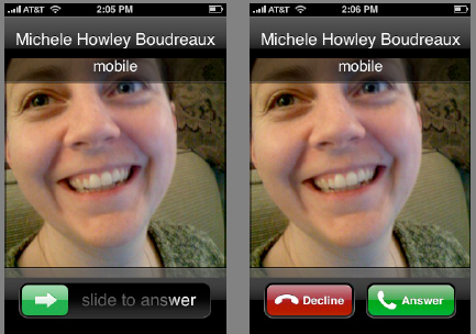
    A quick and easy way to avoid this anti-pattern is to print out wireframes of your design and overlay each screen on top of each other over a lightbox and to be careful where your exit or quit button is going to be, assuming that your users may add an extra tap by mistake.

    App as OS

    When the app is running in a mobile environment, it tends to take over the screen giving the user the impression that the application is the OS. Rather than attempt to mediate the entire experience of the device through your app, defer to specialized apps which are designed to handle those functions. Use the YouTube player for videos, the browser for web pages.

    Bullhorns

    Tone down any loud notifications. You can provide a setting to make them louder but remember, you’re embedded into a mobile device which is going to be carried everywhere. If possible, avoid pop-up error messages and embed your error message into the interface.

    The Bouncer

    If your app requires a user account, make sure every screen that can be accessed without a login has a link to registration or sign-up. The last thing you want to do is have a potential registered user land on a login screen with no link to a page where they can register.

    The High Bar

    Allow for progressive degradation of your application. Remember, you’re app is operating in a mobile environment. Assume that connections will be flakey, the phone not running the latest OS. Remember the guy on the bus that’s just gone into a tunnel. What about the one-handed user on the subway? Can he they use your app effectively?

    Memory Lapse

    Make sure your application is able to persist state. There’s nothing worse than having to step back through to get back to where you were. The illusion of fast task-switching, pausing and unpausing, requires state persistence.

    Gesture Hijacking

    Take care not to take over and re-define a popular gesture. It’s a balance because you also don’t want to try and be too clever and introduce a new behavior that has too steep a learning curve.

    Spin Zone

    Don’t rotate the screen for the heck of it. Fancy UI elements to be used in moderation.

    Sound Off

    Don’t hijack audio that is already playing. This is a common one. How many times have you been listening to music and then start playing a game that requires you jack the volume way up. When you quit out of the game, you blast your ears off as your music player comes back on.

    It’s much better to blend the sounds so the user can take care to switch to the background app and shut it down or pause it.

    Apple has done a lot of careful thinking about interface design on the iPhone expanding their work on the Human Interface Guidelines to the mobile environment. The iPhone HIG is a good resource for anyone designing for the mobile environment.

    Hope these iPhone UX Anti-Patterns were useful. Can you think of any others?

  • Dopplr City Colors

    Did you know that dopplr assigns a unique color to each city? Neither did I. It’s not just random either – there’s an algorithm at play here. From the dopplr blog:

    We wanted a deterministic RGB colour value for each city. At first, we tried mapping the latitude and longitude of a city to a point in colour space, but we found that this made neighbouring cities too similar in colour. This means that people who travel frequently between Glasgow and Edinburgh wouldn’t clearly see the difference in colour between the two. Also, since so much of the Earth’s surface is covered in water rather than cities, it leads to a sparse use of the potential colour space. In the end, we went with a much simpler approach: we take the MD5 digest of the city’s name, convert it to hex and take the first 6 characters as a CSS RGB value.

    So now you know why San Francisco is pink, Helsinki is brown, and Berlin is red.

  • Open ID Design Summit – Links to coverage

    For various reasons I was unable to attend the Open ID Design Summit. Thankfully, the talks were very well covered so it’s possible for anyone see what happened and the current state of discussions around what’s being called the “open stack”

    Live-blogging the openid design summit – John McCrea from Plaxo did a great job of live-blogging the event. This is the best place to start because his post also embeds all the presentations. Thanks John!

    OpenID user experience tackled – by Carsten Pötter links to PuffyPoodles.com, an example of an OpenID pop-up form which uses remote authentication using a Google ID.

    Chris Messina just posted a bunch of video clips:


    OpenID Design Workshop Introductions from Chris Messina on Vimeo.

    More below the fold:

    (more…)

  • Dopplr 2008

    Dopplr 2008


    I didn’t travel much in 2008 but Dopplr’s year-end summary sure makes it look pretty.

  • Do You Watchphone?

    lgwristwatchphone

    According to the Register, LG Electronics is gearing up to offer a wristwatch phone at CES next week.

    There are two ways to look at this announcement and I’d be really interested to hear what people think.

    1. This is the first announcement of a new form factor for phones. What looks clunky today will eventually be slimmed down and integrated into a beautiful piece of jewelery. Pair this with a bluetooth headset and make it a touchscreen and you now have a personal internet device that you can wear on your wrist. First generation devices will be for the geek set that wants to play Dick Tracy but in the future there will be a wide range of styles that will redefine a new type of personal technology. Think of what G-Shock and Swatch did for the wristwatch industry.

    2. Remember the calculator-watch of the 80’s? It’s now been delegated to the nerd history dump, a curio admired only by niche collectors. The same will happen with the Watchphone. Just as with that calculator on your wrist, no one wants to be caught diddling around with buttons on their wrist – the physical action of picking up a phone to make a call or browsing the web with a device you hold in your hand is too strong a social signal to overcome for a serious market to develop for these devices.

    What do you think about the watchphone? The an important first in a new category or future gadget roadkill?

  • Yahoo on Widget Architecture

    I was at the local Mobile Monday event last night to learn more about Yahoo’s Blueprint development framework and soak up some of the local mobile scene. One of the presenters, sorry, didn’t catch his name, was the UI Designer and he Bill Bull, Head of Platform UED, made a very insightful comment about web development.

    usatoday.com is a website – our expectation is that it will change every day as new content is available.

    Microsoft Word is an application – we expect it to work the same way every day.

    Modern websites such as Facebook or the new Yahoo (Metro) home page are a collections of widgets that change and update themselves as new features get pushed out. It’s a mistake to think of widgets installed on a mobile device as applications, they need to be architected as dynamic pieces of code that can update themselves as new features become available or as new devices offer new capabilities. The update mechanism is a fundamental feature of any web-enabled widget.

  • Facebook takes away your thumbs

    Inside Facebook noticed that the thumbs up icon no longer on the Facebook mini-feed.  All in the name of simplification says Facebook but to me it seems like they’ve removed a sense of control over the feed I once thought I had.

    No Thumbs Allowed

    Curiously, the FAQ is still there.

  • Flickr Stats Under Construction Animation

    Flickr released it’s stats feature for Pro members today and while your stats are being crunched, they show the classic “under construction” animated .gifs. What people may not know is that there are three versions that you get in somewhat random order.

    There’s more where these came from. . .

  • Sad Cubicles

    MyBlogLog world headquarters is in Berkeley which is normally packed with eager young interns brimming over with cool ideas to re-invent the world. But school’s back in session and most of the interns are cramming for their finals so it’s really, really quiet around here. We’ve been busy day-to-day but methinks a half-day of redecoration is in order. I could bring in some posters, there’s also a couch over on the other side of the office that no one is using. . .

    At least we don’t have sad cubes!