Tag: design

  • Jack Dorsey the Zen Master

    I had a great day yesterday at the GigaOM Roadmap conference. The agenda had a number of great speakers including Brian Cheskey of AirBnB and Tony Fadell of Nest, the red hot company that is re-defining what a thermostat should look like.

    The thesis the conference explored is one that Om Malik (now my boss) has put forth a number of times. If you think of the steam engine as the PC of our age and the portable version of this technology, the locomotive, as the mobile phone, what does increasing bandwidth and the enabled mobility mean for society and businesses going forward?

    Each speaker chipped away at this thesis with their own slant but Jack Dorsey, as he described how Twitter has enabled empathy on a global scale and how Square has removed the barriers of a Point-of-Sale system and the, “massive counter” that sits between a customer and the vendor, more than anyone else opened my eyes to the incredible transformation going on around us.

    Yet, in light of all these incredible transformations, Dorsey challenged us to maintain a balance between the “sleek, modern perfection and the rustic, zen-like chaos” and to build products that maintain this “balance in-between”. He referenced the Japanese design aesthetic of wabi-sabi (if you want to read a great book about the topic, I highly recommend Wabi-Sabi: for Artists, Designers, Poets & Philosophers).

    In the end, Dorsey advised all product managers to guide themselves with these two principles.

    1. Simplification, work real hard to get technology down to its essence (of an interaction). Take away the “conceptual debris”
    2. Make things fun, remember to be human, relate, “have some whimsy” in your application and make it human.

    The whole interview is worth a listen.

    [There was a video embed below but it’s been lost to the sands of time. You can find a short transcript of the interview on this Forbes article.]
  • Oblong and the g-speak UI

    Remember the computer UI in Minority Report? Yeah, they can do that now.

  • The $8,000 dumb phone

    The $8,000 dumb phone

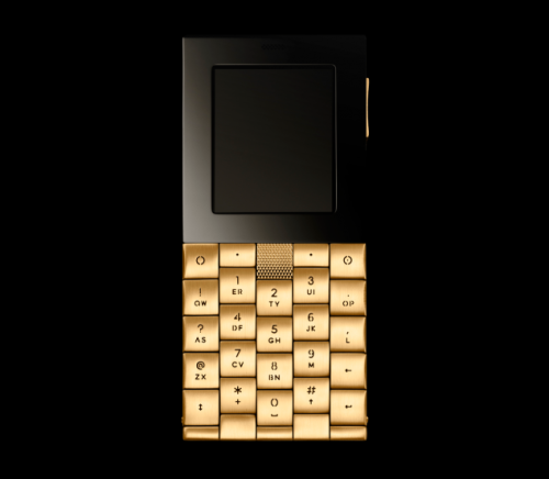
    When you can afford a personal secretary to keep track of your every need, a mobile phone is basically a piece of jewelry, much like a wrist watch or pocket watch of by-gone days. These are single-purpose devices that are a fashion statement, more form than function. Taking this approach, focused on the voice aspects of mobile phones, Aesir, a design firm in Copenhagen, has designed the phone to go with your Rolex.

    Fitted with a sapphire crystal, metallic-coated ceramic antenna, and keys that are individually screwed on by jewelers, designer Yves Béhar (his SF-based fuseproject firm designed the Jawbone headset) give you a phone as a work of art. No camera, no email, no internet browser, just a simple object of desire, purpose built to receive hush-toned murmurs from your Swiss banker or to whisper sweet nothings to your mistress in St. Tropez.

    While they have stayed away from anything as gauche as a Facebook or Twitter client, you do get bespoke icons, original typeface, and ringtones composed by Vietnamese-Danish ‘master of the upright bass’ Chris Minh Doky.

    Please pass the Grey Poupon.

  • Social Decay

    Social Decay

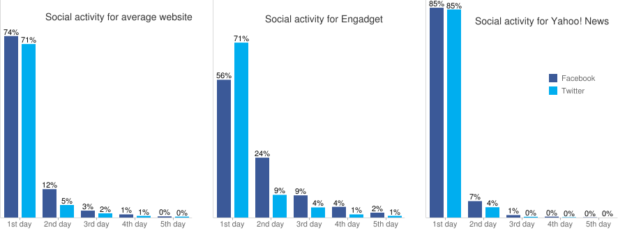
    The money shot from yesterday’s Yahoo Research’s Like Log study is the social activity graph below showing how this activity drops off a cliff after the first 24 hours.

    Looking at over 100,000 articles across 45 big media sites over the course of three months, Yahoo researcher Yury Lifshits found that a vast majority of the Facebook Like and Twitter Retweet activity. Broadly, 80% or more of the activity takes place during the first 24 hours following the posting of a story. No surprise here, News is about New.

    The conclusion from  Yury makes is that sites that put out more than one story a day actually run the risk of splitting their traffic if they can’t double it. Each additional story/day diminishes the return and may contribute to burnout of your audience. This runs counter to the leaked AOL way memo pushing for quantity over quality.

    Gawker Revisits the Front Page

    Gawker famously underwent a redesign that reinforces the conclusions made by the Yahoo research. Look at the redesign before and after and you can plainly see. The image below is their traditional “blog” output which presents the latest story at the top with newer stories pushing the older ones down the page. The default Popular Now column on the right gives some counter-weight but otherwise it’s the standard, reverse chronological layout.

    Gawker.com Old View

    Now contrast this with their new look below. Notice how much more emphasis is placed on the images. This view is called their “Top Stories” view and they’ve taken away all timestamps on the stories as that is not the point of how things are laid out. This layout has an editorial touch to it, the Gawker editors are putting stories in front of you they want you to see.

    Gawker.com New Design

    Nick Denton, the founder of Gawker, posted at length on the thinking behind the redesign.

    We need a few breakout stories each day. We will push those on the front page. And these exclusives can be augmented by dozens or hundreds of short items to provide — at low cost — comprehensiveness and fodder for the commentariat. These will typically run inside, linked by headlines from the blog column, so the volume doesn’t overwhelm our strongest stories.

    and later,

    A prominent “splash” slot on the home page — taking up the two-thirds of the page — can promote the most compelling gossip and scandal. But it also provides the opportunity to display our full editorial spectrum. The front page is our branding opportunity. It’s a rebranding opportunity, too, a way to demonstrate intelligence, taste and — yes, snicker away! — even beauty.

    Back when I was selling the idea of blogs to media companies, I remember saying to them that the front page is dead and that people were coming in the side door to their sites via shared links and pointers from the search engines. This was why it was important for them to make sure each page could stand on it’s own as its own front page for their business.

    It seems as we have come full circle with the larger blog sites now focused back on the front page, picking favorites to be their star headline stories for the day. Are we giving up on social mediation to solve the information filtering problem? Are we going back to a world where we start each day with a collection of bookmarked top sites we visit daily? Are we going back to appointment television? Do we abandon the firehose feed and stick to just the top stories?

  • Re-Skinning Facebook

    Re-Skinning Facebook

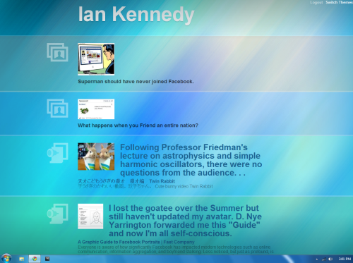
    Stumbled across a quick and dirty side project that uses Facebook’s social graph api to pull your newsfeed and present an alternate display. Try it yourself at Facebook-me.com.

  • Use your bike to charge your phone

    Sometimes it’s the simple things. Why not a dual purpose phone charger, phone mount for your bicycle? Stay above 7.5 mph and you’ll charge your phone at the same rate as if you plugged it into the wall and you’ll be able to enjoy free turn-by-turn navigation.

    Launching first in Kenya where it’s really needed but also coming to the first world sometime hopefully soon.

  • docomo’s designer collection

    My wife just got back from Japan and picked up the latest brochure from NTT Docomo. As a member of the very desirable young female demographic, she’s always been pestering me that Nokia should focus less on whiz-bang geek features and more on the phone as a fashion statement.

    I would agree and, in that vein I present to you this year’s Summer collection from docomo, part of their “style” series.

    Up first is the Emilio Pucci phones featuring the trademark geometric shapes of that famous Italian designer. These phones are made by Sharp. Check out the video where the announcer is impressed with the front-facing camera that can be used as a mirror!

    FrancFranc is a Japan-based interior designer. Their phones are made by NEC. The main features of this phone are a keypad with a unique LED lightshow when you flip it open and custom designer wallpapers that come pre-installed which you can see on the video.

    NY handbag designer kate spade makes an appearance with the signature two-tone finish on the outside. This phone is made by Panasonic and features an “eco-mode” that turns down the display lighting and increase battery life. A squeeze on the sides of the hinge opens the phone and a unique pink LED “illumination” on the front cover activates when you fold the phone shut. The bubbly Tokai Walker reporter is once more on the case.

    OK. It kills me that this isn’t a Nokia but I guess Sharp is going to see what they can do to interpret the marimekko brand  as a keitai. The phone features the signature Unikko pattern with matching wallpaper inside and colorful treatment on the buttons inside. Sharp has also taken the time to outfit the animated sheep that walk across the screen into marimekko patterns. Our video announcer pronounces this phone, kawaii.

    British interior designer Conran burst onto the Tokyo designer scene a couple of decades ago with a splashy book launch and showcase store in Shinjuku’s hip Park Tower complex. The brand holds sway and LG has worked with Studio Conran to produce this phone. This phone goes out on a limb by not going with the flip-phone form factor deciding instead to look at the ergonomics of the phone. It’s gentle curve is so that it can easily fit in your back pocket and hug your face. Coming in Brown, Black, and Dark Red, I’m thinking this phone is targeted for the older, thick rimmed glasses type that tends to prop the phone on their shoulder while sketching notes.  The Tokai Walker crew spends most of the video analyzing the design before they even turn it on.

    For the full marketing experience, check out NTT’s mini-site including the wonderfully weird Darth Vadar Who is My Boss clip.

  • Evolution of Cell Phone Small

    mobile-evolution-1Designer Kyle Bean makes Russian matryoshka dolls out of cell phones. From the Motorola DynaTAC 8000X (1983) to the Apple iPhone (2007).

  • Less Powerpoint, More Prototypes

    no powerpointI’m a big believer in hacking together a working prototype to demonstrate product ideas. Powerpoint mocks basically put a shiny gloss on a paper sketch and because it’s not real, generate endless debate where no one is really speaking on authority because the product doesn’t exist.

    Once you have a prototype the debate becomes substantive.  Prototypes trump PowerPoint every time. Building a quick prototype is a way of sketching an idea – the emphasis should be on quick on dirty – get the pieces working with real data to see how things move, that’s it. Expect reactions and expect that you’ll need to tear it apart and redo things, that’s ok – expect that people might hate it and you’ll throw it away. Because of that, don’t invest too much time or ego into your prototype either, it will change, guaranteed. In this sense, churn is good.

    This is why I really enjoyed Paul Buchheit’s post Communicating with Code where he writes about how both GMail and AdSense came together.

    Of course none of the code from my prototype ever made it near the real product (thankfully), but that code did something that fancy arguments couldn’t do (at least not my fancy arguments), it showed that the idea and product had real potential.

    The point of this story, I think, is that you should consider spending less time talking, and more time prototyping, especially if you’re not very good at talking or powerpoint. Your code can be a very persuasive argument.

    GMail & AdSense were born from working prototypes, not PowerPoint.  Whenever possible, try and avoid PowerPoint for product design, unless it’s for art.

    Reblog this post [with Zemanta]