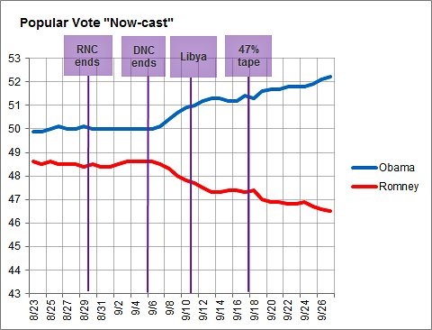
The New York Times’ wonky FiveThirtyEight blog posted this rather dramatic graph showing the poll numbers of Obama and Romney over the past few weeks. What used to be a 1-2 point difference is now a 5-6 point gulf with the lines getting further, not closer, together.
Leave a comment