
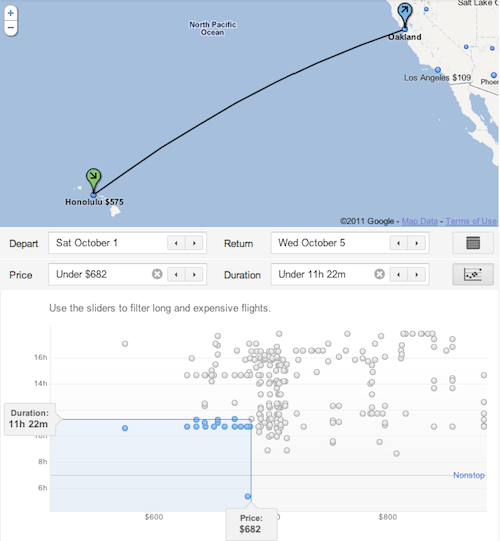
Google’s Flight Search scatter plot visualization of fares is brilliant. Word is that fare data is still light (they don’t have any international, non-US fares) but the UI has put all other travel comparison sites on notice.
a blog by Ian Kennedy
Written by
Google’s Flight Search scatter plot visualization of fares is brilliant. Word is that fare data is still light (they don’t have any international, non-US fares) but the UI has put all other travel comparison sites on notice.
Hm, better UI than Hipmunk?
Hipmunk is definitely nice but in terms of seeing sheer number of flights on one screen, Google Flight Search wins for me.
Leave a comment