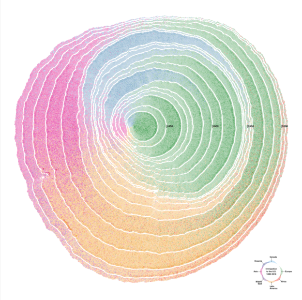
In celebration of the diversity of the 116th congress, I’m sharing this beautiful visualization illustrating the diverse origin of immigrants to the United States over the years.
Data visualization with a poetic take on the data — historical immigration to the U.S. is shown as a set of tree rings (1830-2015). As time advances, the tree grows, forming rings of immigration. Each ring corresponds to a decade. Cells are deposited in layers, and each cell corresponds to 100 immigrants that arrived in that decade from a specific region outside the U.S.
Pedro Cruz is an Assistant Professor in information visualization at Northeastern University and his work above was one of the winners in the Kantar Information is Beautiful awards. If you like this kind of stuff, you really should check out the other winners.

Leave a comment